THE COND'OR Identity
The Cond’Or residence is an 72 apartment building, spa , fitness center and common areas, now sold out, set with the culturally and elegant “Toison D’or Avenue” (where does the name come from).
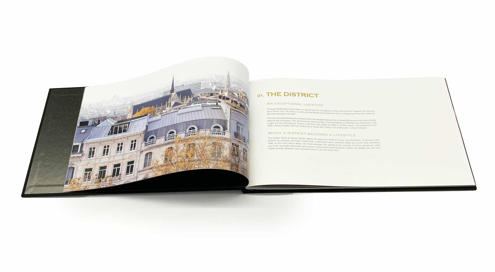
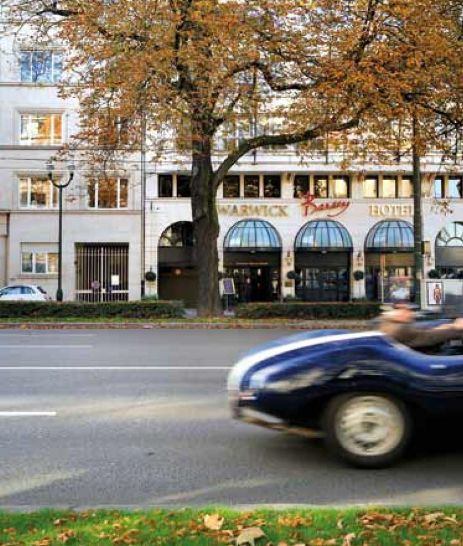
Part of the developer’s ongoing enquiry into and interrogation of the dialogue between architecture, interior and place: this interrogation forms the basis of THE COND”OR brand identity and book bound together, placed side-by-side delivering a juxtapositional concept of architectural structure and neighbourhood context expressed through the interplay of photography (Nicolas Schimp), text, surface and materiality.
branding / retail
- TIMELINE: 2014
- STATUS: Completed
- LOCATION: Brussels, Belgium
- CATEGORY: Residential
- PROGRAM: Brand identity & Interior Design : appartements, Spa & fitness center, commun areae
- CLIENT: Optima Global Estate
- ASSOCIATIONS: Quintessentially Benelux Group
- PHOTOGRAPHY: Nicolas Schimp

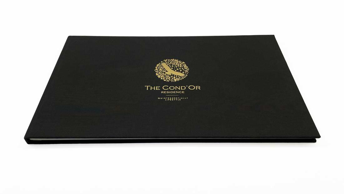
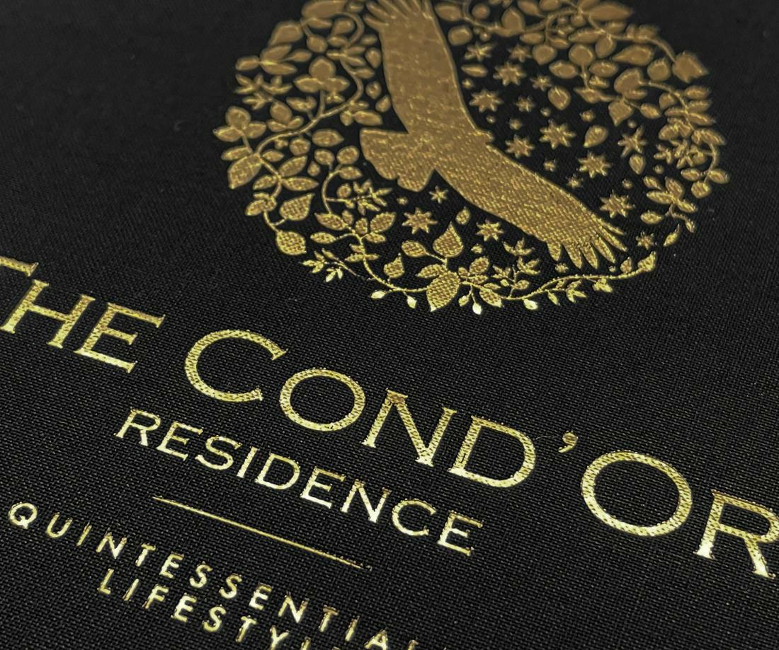
THE LOGOTYPE IS LIGHT, ICONIC WITH AN ILLUSTRATIVE INTENTION. THE CUTTING OF COMMERCIAL TYPE, THE INTERSECTION OF MODERN UTILITY AND CLASSICAL LUXURY IS A FAMILIAR GESTURE THAT ADDS LITTLE WHERE THESE SENTIMENTS REALLY COME ACROSS WELL IN THE INTERSECTION OF MATERIALITY AND IMAGERY.
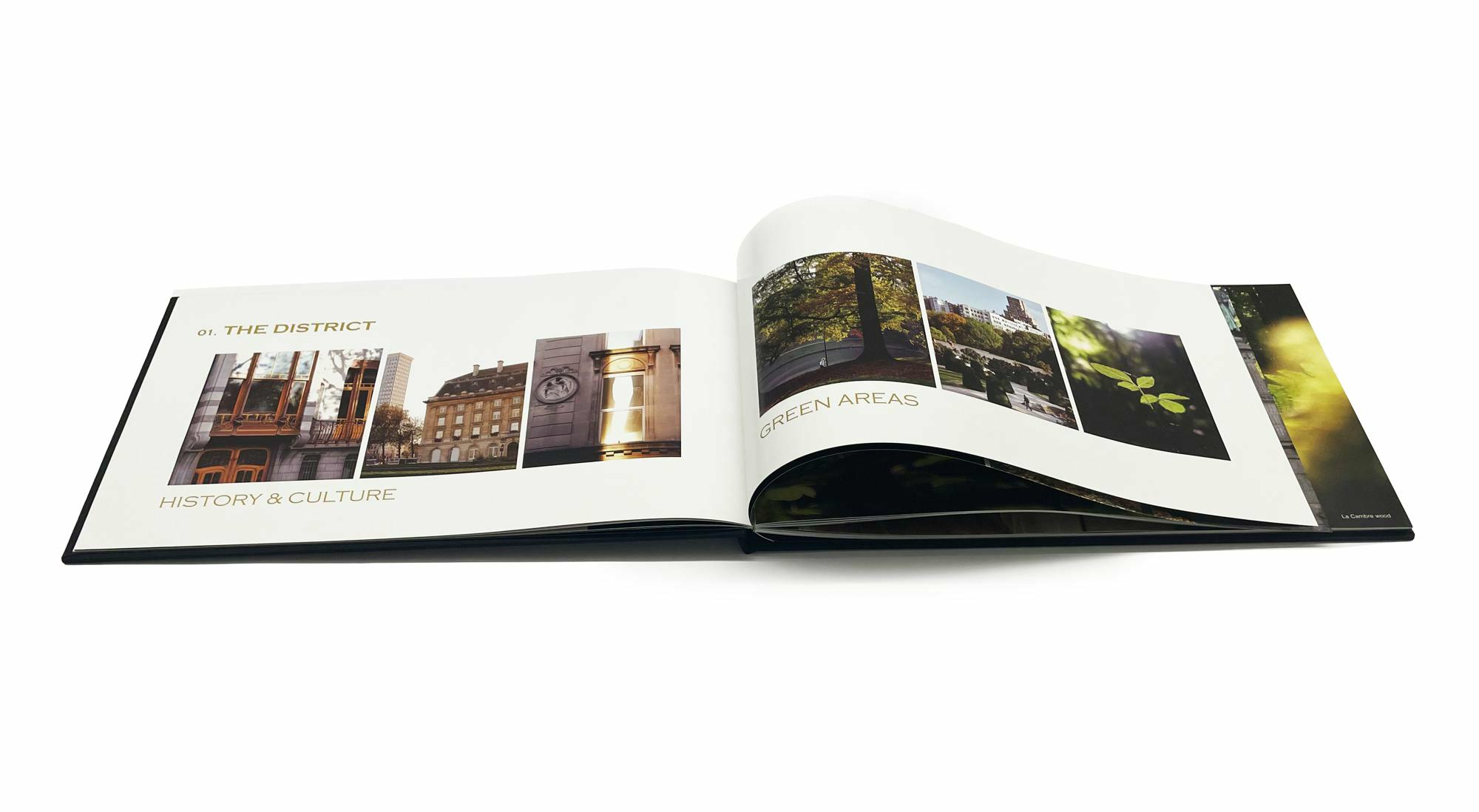
MUCH OF THE GRAPHIC AND MATERIAL LANGUAGE EMPLOYED DISTILS DOWN THE HIGH-QUALITY BUILD OF THE PROPERTY THROUGH FEW BUT CONCISE GESTURES; IN SURFACE, TEXTURE, EMBOSSING, BINDING AND COLOUR.

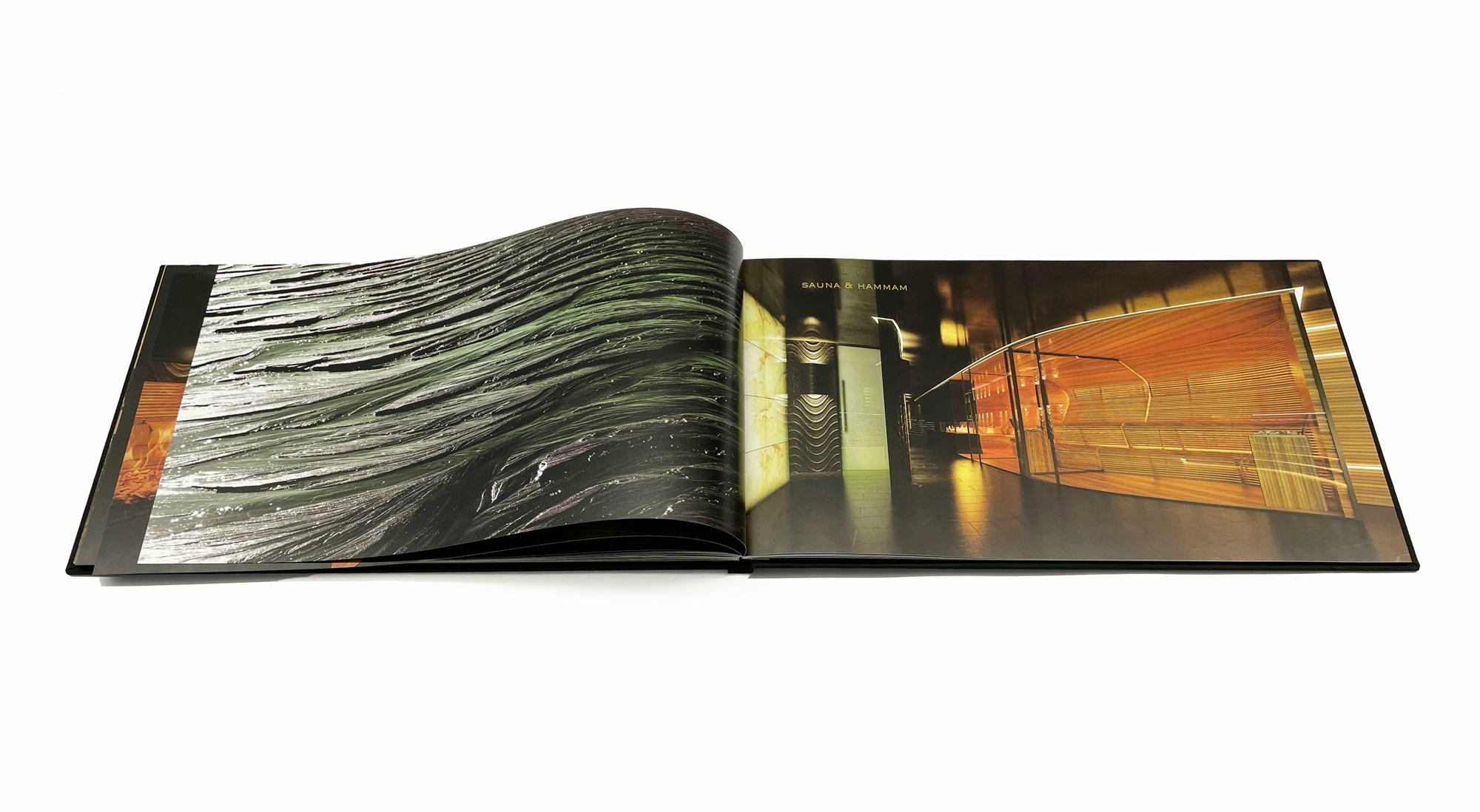

MUCH OF THE GRAPHIC AND MATERIAL LANGUAGE EMPLOYED DISTILS DOWN THE HIGH-QUALITY BUILD OF THE PROPERTY THROUGH FEW BUT CONCISE GESTURES; IN SURFACE, TEXTURE, EMBOSSING, BINDING AND COLOUR.

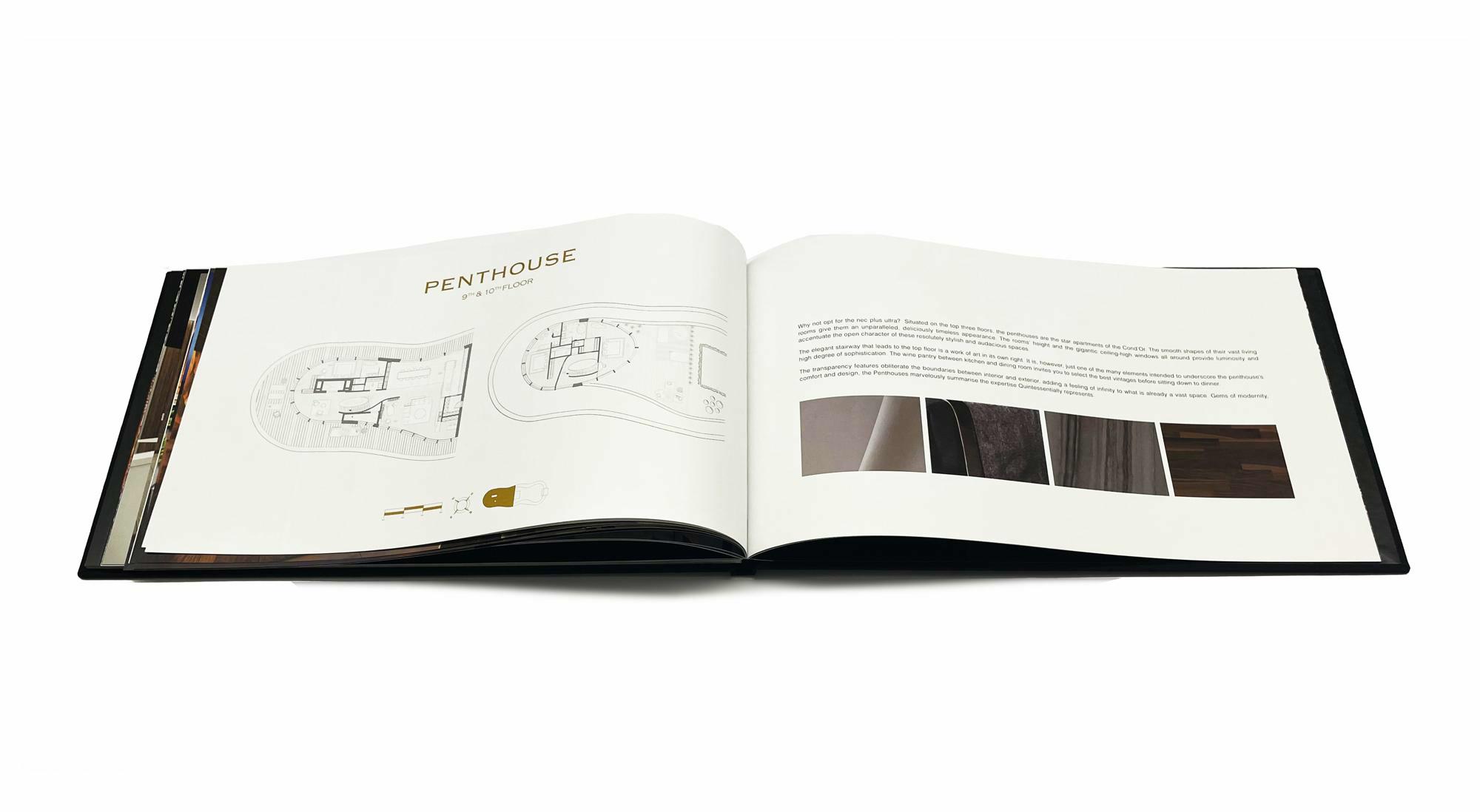
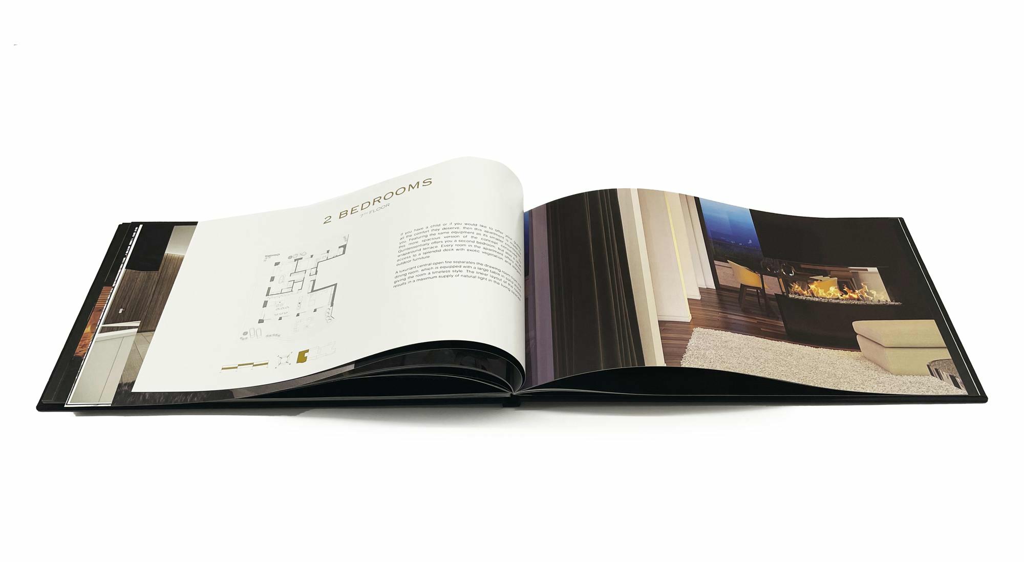
Graphic design were commissioned to create a visual identity for THE CON”OR RESIDENCE that would assist the real estate team in presenting the project to potential buyers, and help, in conjunction with the building’s distinctive structural and interior design plans, elevations and renderings, to distinguish THE COND”OR within a crowded luxury apartment market.

